SMRT Ultra
Client
SMRT Systems
Location
Malmö, Sweden
Year
2024
Info
Overview
SMRT Systems makes software for dry cleaners. SMRT Ultra is the mobile app I designed so owners and counter staff can run the shop from a phone: take orders, manage customers and check how the day is going.
My role: UX Lead, from flows to final UI.
Two people, two needs
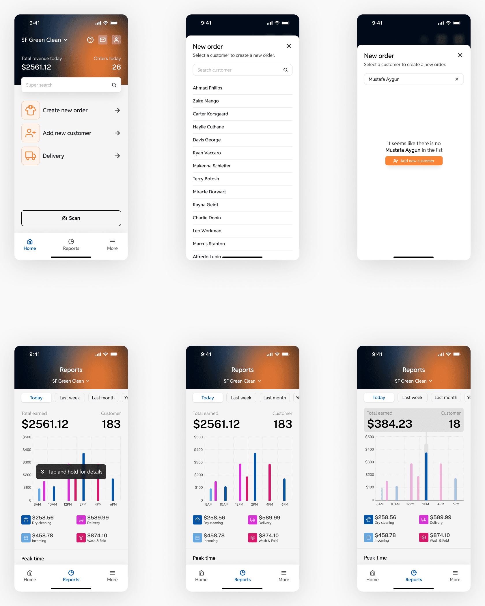
The person at the counter wants speed. A customer drops off a bag of clothes, there's a line behind them, and every tap costs time. The owner wants control over prices, discounts, staff, payslips and how today compares to last week. In a small shop these are often the same person, switching roles all day.
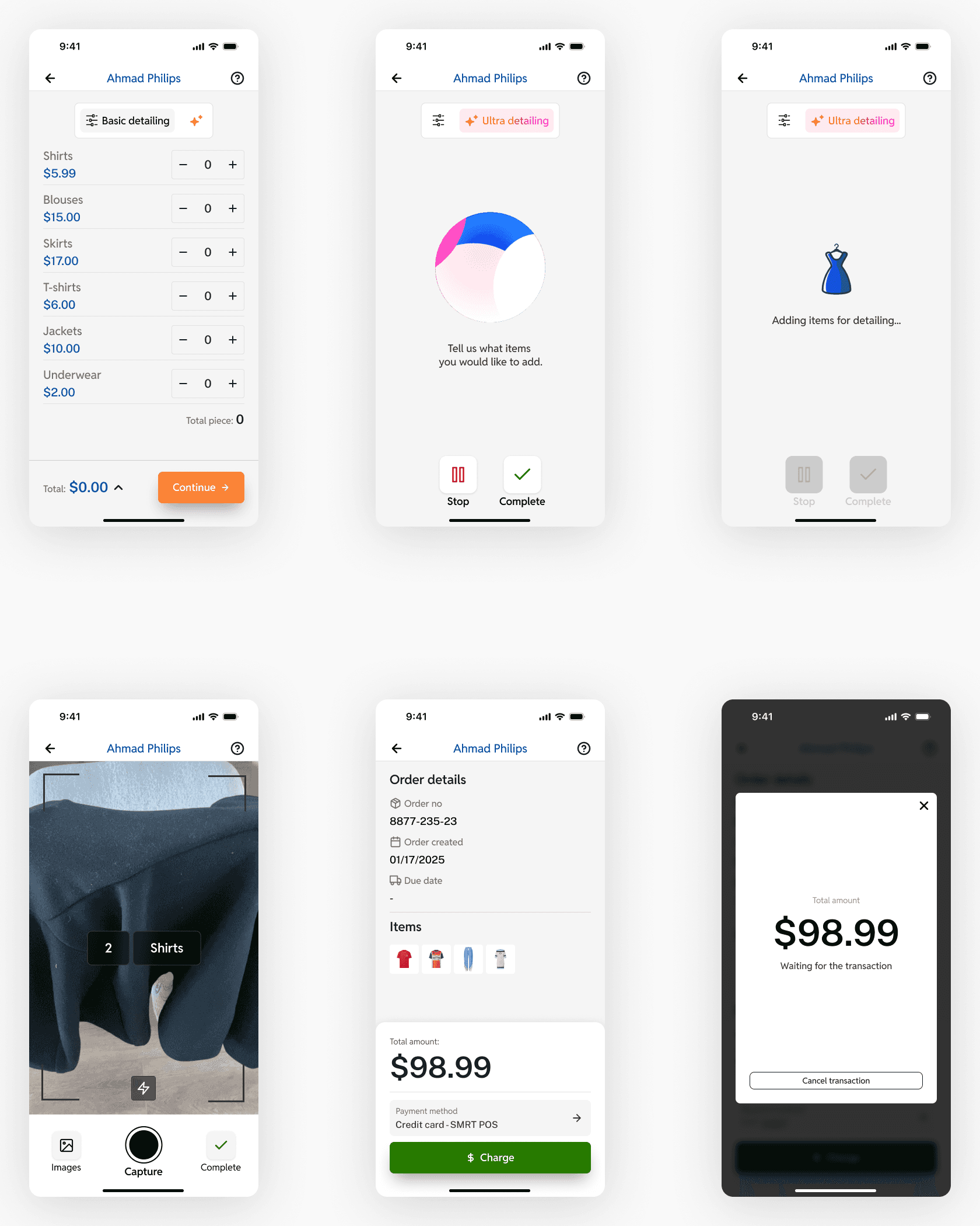
That shaped the structure. Taking an order is fast and linear: pick the customer, add items, take photos, pay. Everything the owner needs sits under More, one tap away but out of the way.
Decision 1: voice, but never a black box
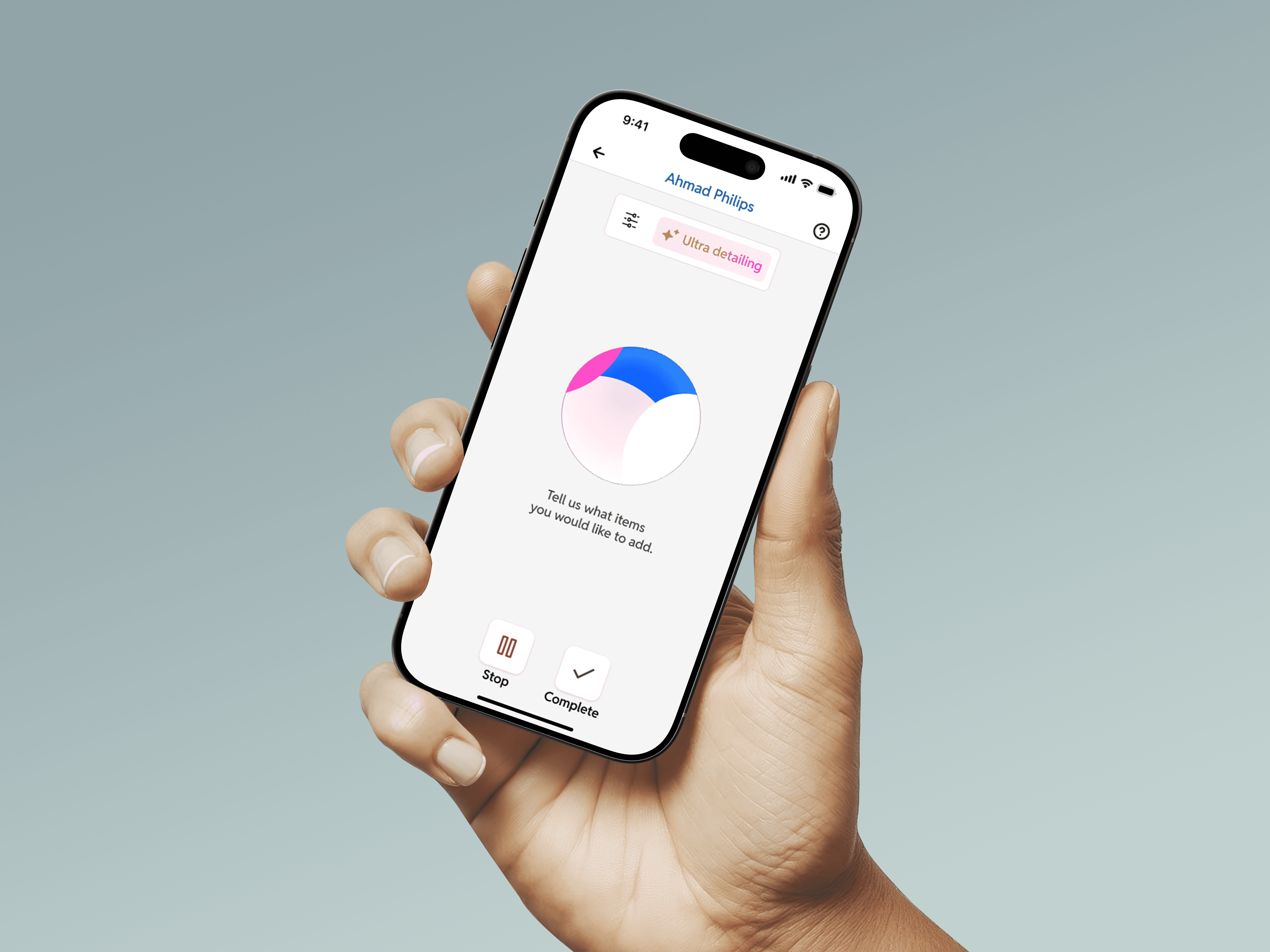
Adding items was the slowest part of taking an order. With Ultra detailing, staff just say it, like "one shirt, three blouses, two skirts", and the app turns it into an itemised list with prices.
I held on to two rules. Voice is optional, so a switch at the top moves between Ultra and basic entry. A noisy shop or an unusual item should never block anyone. And the result is always editable. Every line has a quantity stepper and the totals update live, so staff check the order instead of trusting it blindly.
In pilot testing, staff started using voice as their main way to take orders.
Decision 2: from menu to dashboard
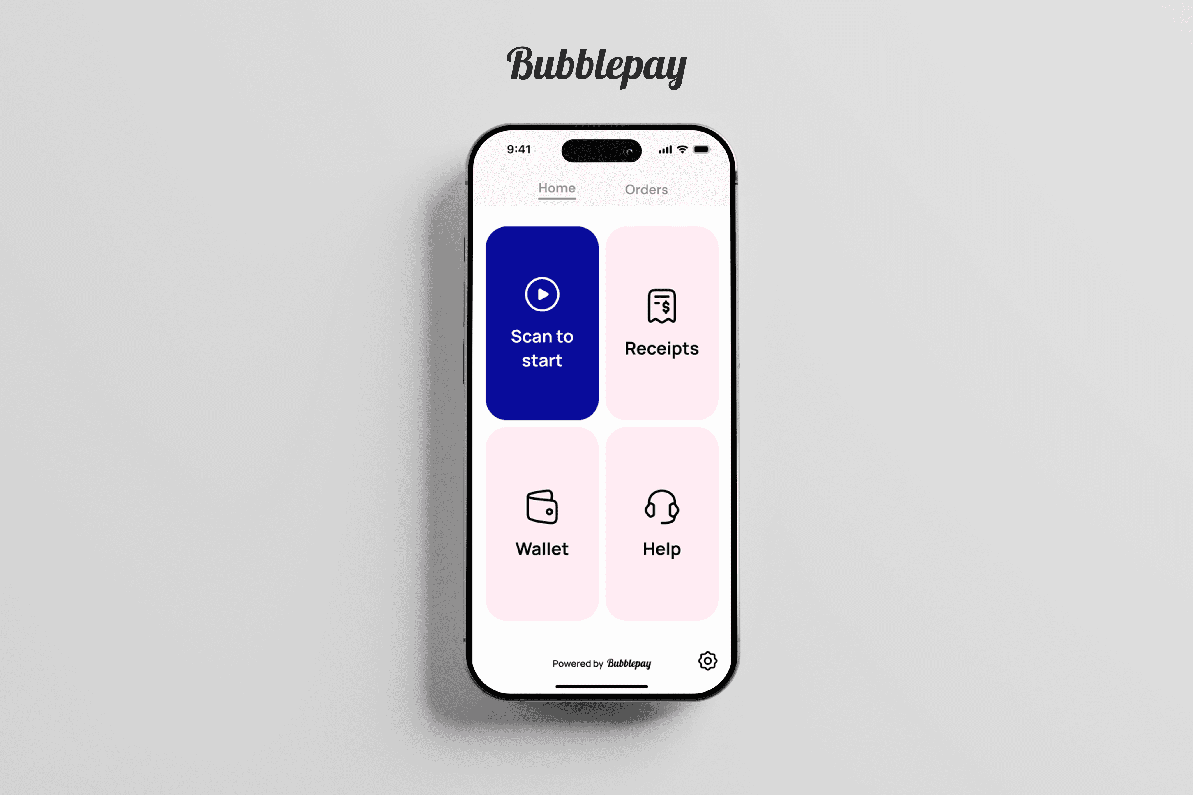
The first version opened on four big tiles: Delivery, Reports, Customer and Scan. It looked clean, but it was a menu. You had to decide where to go before you could do anything.
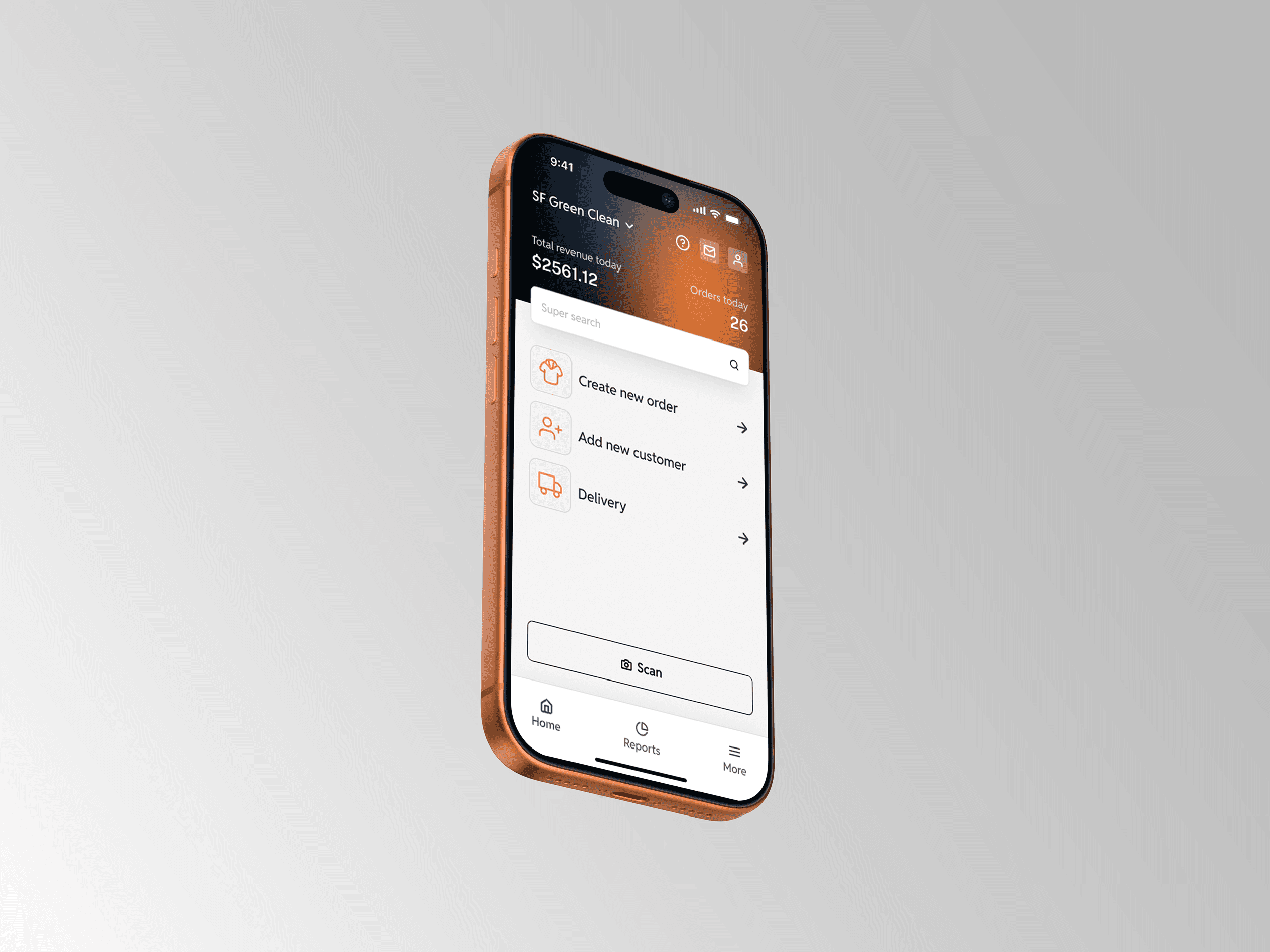
After testing it myself, I rebuilt the home screen around the day. Revenue and order count sit at the top, the three most common tasks come next, and Scan gets its own button at the bottom where a thumb reaches it. Navigation moved to a tab bar with Home, Reports and More.
The voice results screen changed the same way. In the first version, the steppers next to each item showed unclear values. Now they show quantity, with total pieces and total price underneath.
Decision 3: design for when things break
In a shop, things go wrong all the time. A card gets declined, a barcode won't scan, someone enters the wrong phone number halfway through signing up. I designed those states alongside the happy path, not after it: failed and refunded payments, scan failures, form errors, and a confirmation before leaving a half-finished five-step customer signup.
Built from a system
Every screen comes from a shared set of components, including buttons, inputs, navigation, menu items, switches and progress bars. That kept more than 120 screens consistent, and it made changes cheap when my testing sent me back to redesign.
What I'd do differently
I tested the early versions myself. Next time I'd put them in front of counter staff sooner. A real shop, with real noise and a real queue, would have shown me problems faster than I could find them on my own.